
NEVERNIGHT UK COVER
Hello Droogs!
I bring news. Firstly, due to super high demand, Goldsboro books have ordered the production of more blood-red special edition NEVERNIGHTs. These editions will be signed by yours truly (but not numbered) and there are still a handful left. They’re available by clicking here.
Second! You’ll remember I mentioned a black-edged special edition of NEVERNIGHT last week, pictured below in all its sexiness:
So metal.
I can now announce these editions will be available through pre-order at Waterstones Books. You can do so by clicking here.
Note: the black edition will not be signed. It WILL however, be completely fucking metal.
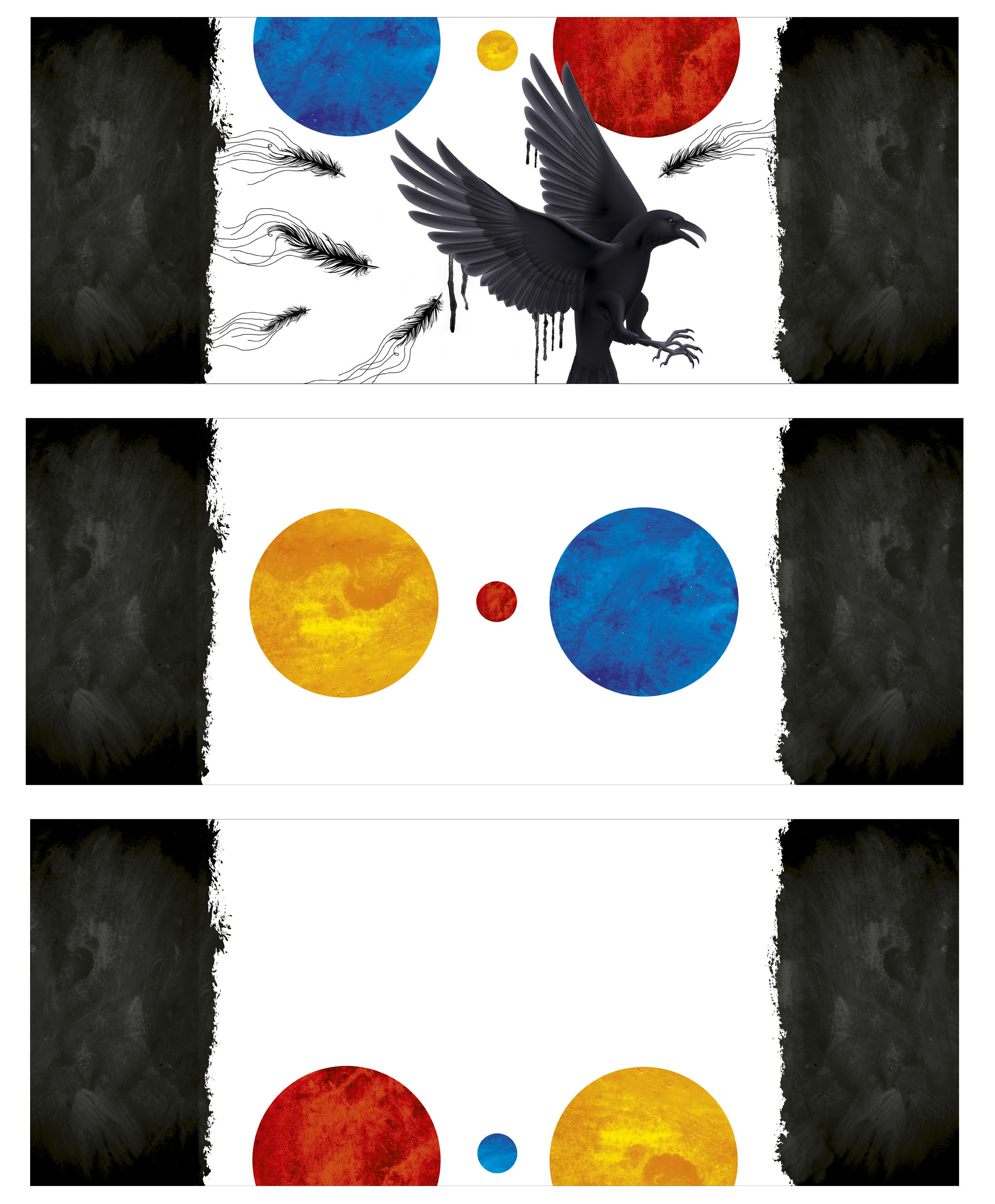
Lastly, I figured you’d like to see the full UK cover in all its glory, so below are pics of the end papers and the full dust jacket and the book just generally looking awesome. The folks at Harper Voyager did such an incredible job pulling this package together, and the level of detail is just bonkers.
After the pics, there’s an article from my amazing cover designer, Cherie Chapman, talking about how she came up with the concept and a little bit about the design process.
Enjoy the sexy eye candy. Right click and “view image” to embiggen.
Full jacket with flap artwork
Endpapers
.
And now, a word from our designer:
Nevernight was presented as an open design brief, which means that the whole team had a chance to come up with ideas and designs for it. I was intrigued by the fact that it was a new epic fantasy trilogy, and because the imagery within it seemed right up my street. I read the manuscript and thoroughly enjoyed the world, characters and their stories; there’s so much to pull from this book, so many possible routes!
Cherie at work. Or at least posing for photos and looking like she’s at work.
I decided to explore what design could work across a trilogy instead of thinking solely about the first book. What really stuck me was the idea of the three suns: Saan (red), Saai (blue) and Shiih (yellow). They are central to the novel and rotate for nearly three years before they set into nighttime (truedark). I thought there could be something really nice in this idea, I just had to figure it out. I knew I wanted the suns to have a sense of movement. In the end I went with stretching the three suns across the cover layout so that there was always one displayed on the front, spine, and back cover. As the series progress the suns position would move across the covers, gradually sinking to give the impression they are also setting. I wanted other parts of the design, like the flaps that fold into the book, endpapers and the book edges to represent the darkness/shadows.
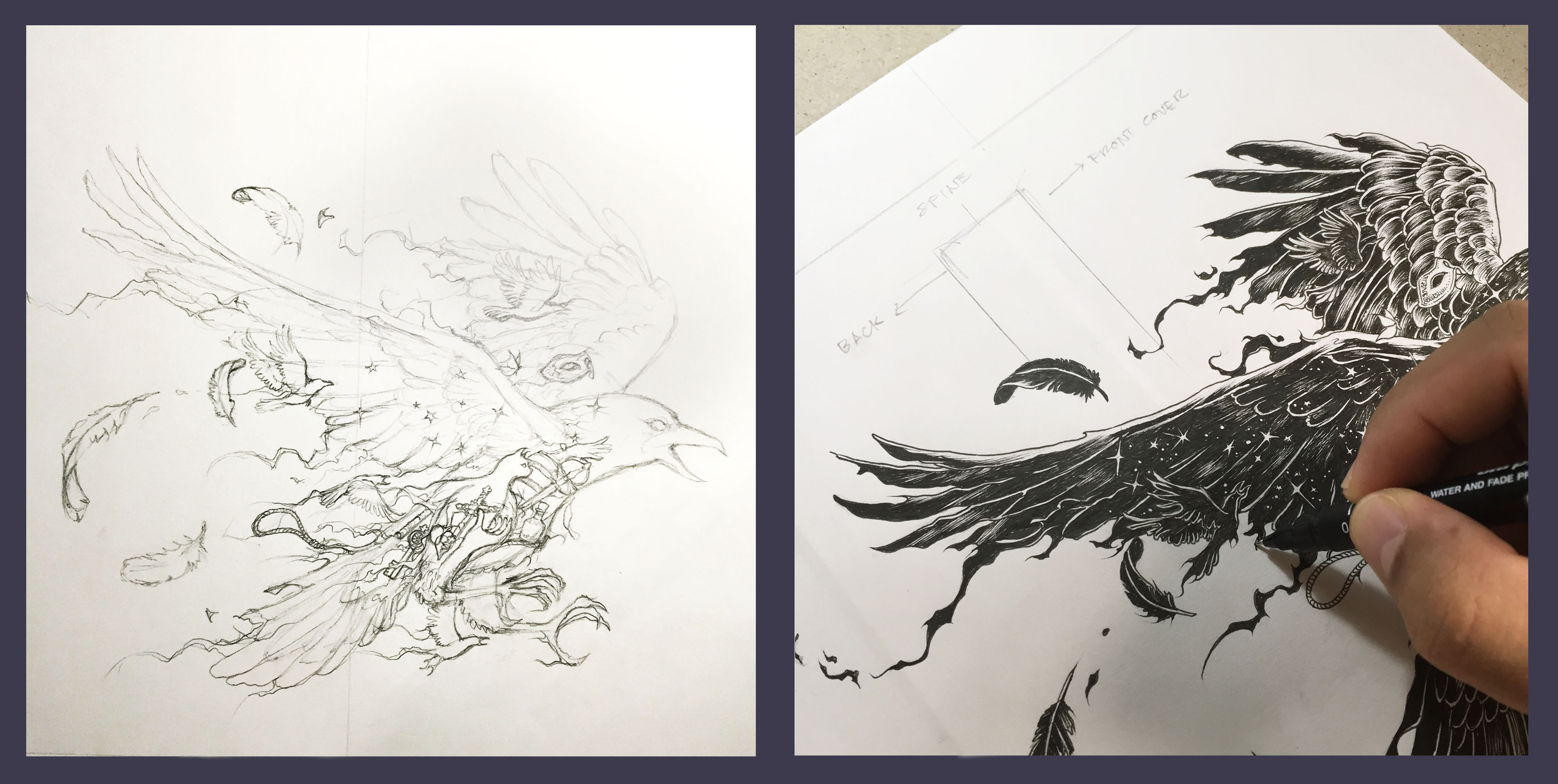
Cherie’s original concept sketches.
My idea was chosen to progress to the next stage.
I knew I wanted the central icon to be illustrated in black and white so that it would present a nice contrast to the bright colours of the suns. After looking through numerous illustrators I finally came across Kerby Rosanes’ work. I fell in love with his detailed ink style and I knew right away that he would be the perfect illustrator for this trilogy.
The crooooow.
A crow was chosen as the main icon, because it is representative of the central character, and is a repetitive image in the novel:
“The blade was crafted of gravebone, gleaming white and hard as steel, its hilt carved like a crow in flight. Red amber eyes gleamed in the scarlet sunlight.”
A crow in flight – and in an aggressive pose – felt like a good match for Mia’s personality and her quest for revenge (also great against the red, bloody sun on the first cover). What initially drew me to Kerby’s work was the way that he so naturally incorporates other imagery within his main illustration, and I thought this would add richness and significance to the icon. Exchanging ideas and suggestions for the detail worked wonderfully, and Kerby even suggested using a night sky within the bird’s wingspan, which I thought was a lovely touch.
I do have some basic plans for book two and three but I don’t want to give too much away yet! I’m sure that once you see the full jacket illustration for yourself you’ll have a good feel for what I’m going for.
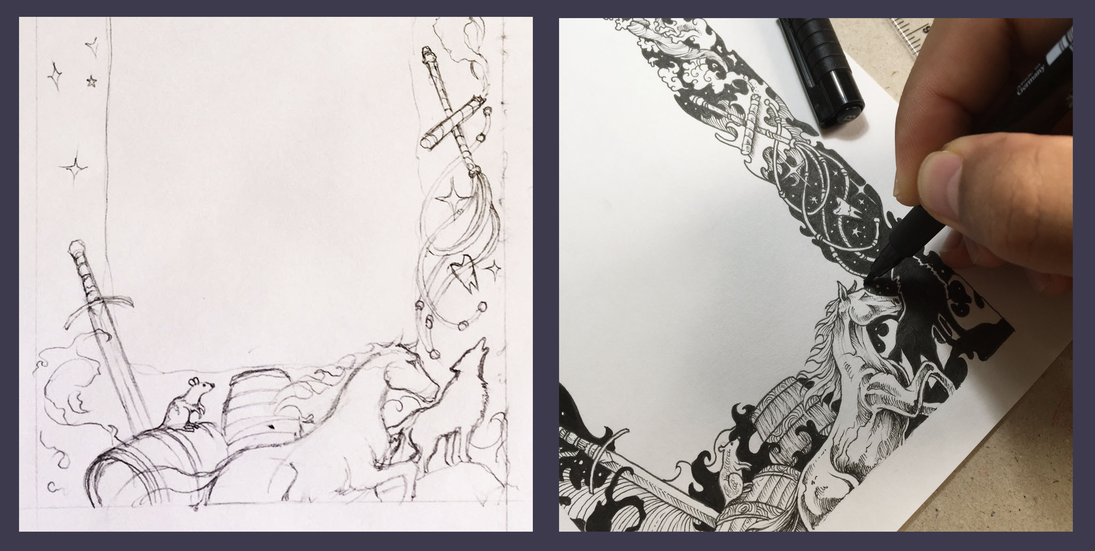
Flap artwork detail, including a horse named “Bastard”.
I really love the final illustration and design, and am very much so looking forward to reading and working on Jay’s Kristoff’s next book with Kerby.
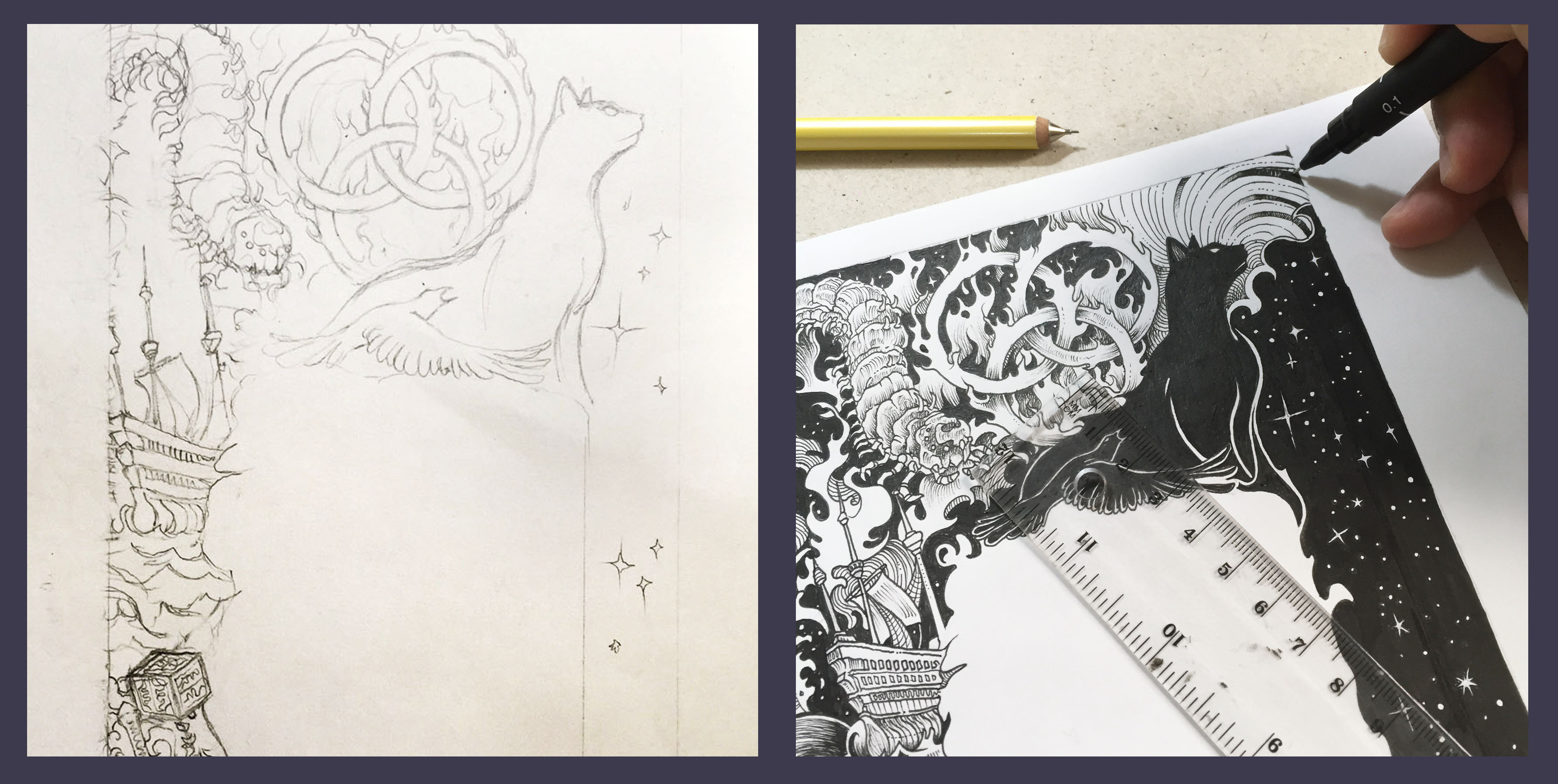
Flap artwork detail, including Mister Kindly.
“It is such a pleasure to illustrate a glimpse to the world of Nevernight through the cover. The elements and the level of detail I put on the illustrations represent some key themes from the story – dark, intriguing and deadly.” Kerby Rosanes

Ahh 😀 I LOVE this post. <3 Gosh, Nevernight is SO GORGEOUS. I love this UK edition 😀 SO much. And ee, I have now pre-ordered the black edges too. <3 I have the red edges numbered pre-ordered too. <3 And regular. And paperback. And two US hardcovers 🙂 Oh gosh. My collection will be HUGE 😀 And I have both UK ARCs. <3 Aaaand I'm getting the US ARC in the mail from a friend shortly 😀 Ahhh. I loved this book so much. <3 ANYWAY 😀 Just wanted to share my love with you 🙂 Hugs. Cannot wait to get all the finished copies 🙂
Haha! Ma’am, you are lucky to have all the editions! I hope to catch ’em all someday when my wife and I move to a bigger home.=)
I really enjoyed the book, is it too early to ask about an eta for the next part?
Your covers are amazing. I prefer the other one, the US I think. Though it looks a bit anime-ish, but that’s mostly because I’m still hooked into the Lotus War. Can’t wait to read this book and any book you spawn!=D
Gaods-dammit I couldn’t pass this up. Now I will have the UK cover with the red edges and a US copy.
Damn you and your awesomeness.
I love this cover! And hearing about how it was designed is amazing 😀 I love the inside pages with Bastard and Mister Kindly ahh so gorgeous I can’t wait to see how the covers progress through the series :D!
[…] go listen to it). If I read one of his blog posts right, I think it’s about 160k (the hardback is a beautiful thing). Obviously, because I self-publish length is always in the back of my mind, though less so now […]
[…] artist, Kerby Rosanes; it’s absolutely brilliant. A real asset to the novel. Here’s a link to Jay’s blog post where Cherie describes the design process. I think it is so much better […]
I looked everywhere for the UK edition of Nevernight in hardcover and it’s impossible now 🙁 I am so so SO sad I missed out on this. The UK covers are beyond gorgeous
I am late to this series and I am in love …. I have searched fruitlessly for the UK hardback edition of Nevernight and it’s impossible. I just like my books in a series matching. It wouldn’t even need to have sprayed edges or signed – just hard back with this cover art!! Ah well, super excited for the last book.